Art Direction
PIQ
TYPE:
Branding, UI
CLIENT:
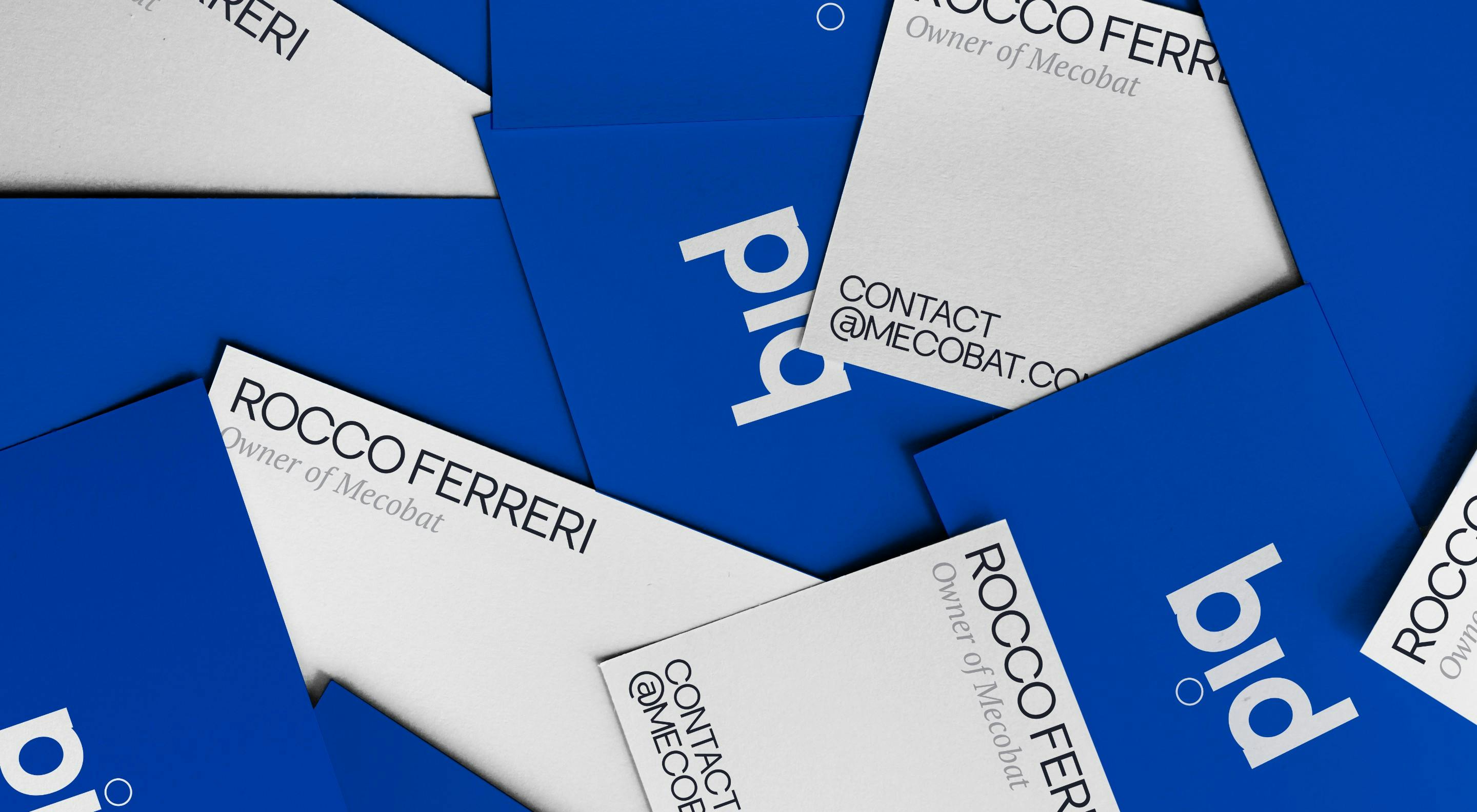
Edilcross x Mecobat


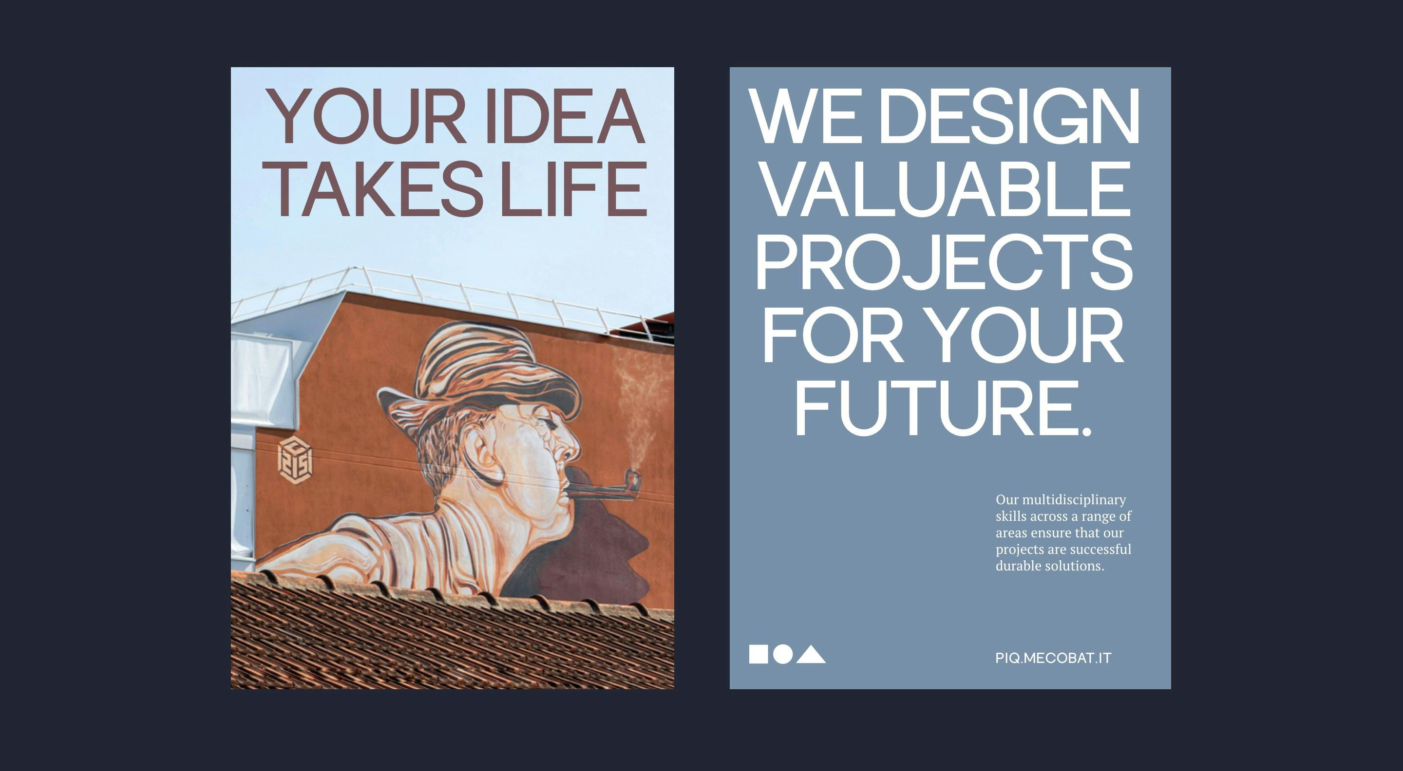
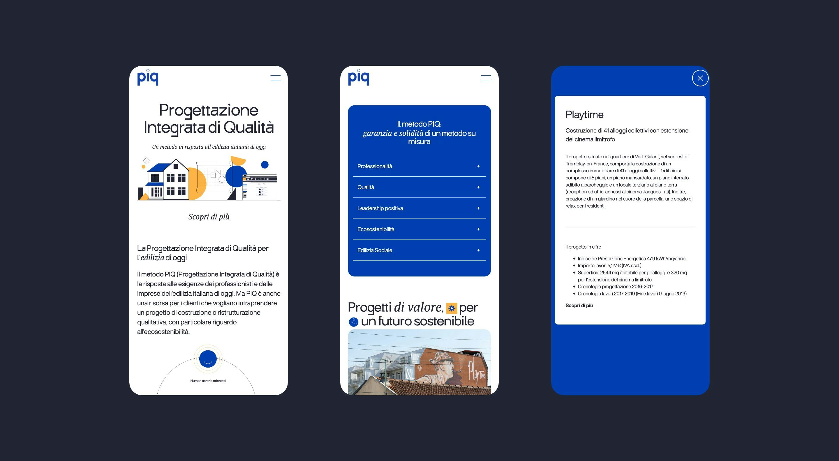
THE PROJECTMecobat is a client of Edilcross who decided to expand to Italy with a reality named PIQ (Progettazione Integrata di Qualità). The acronym stands for their signature method to share their prestigious knowledge and expertise in the filed of construction engineering.
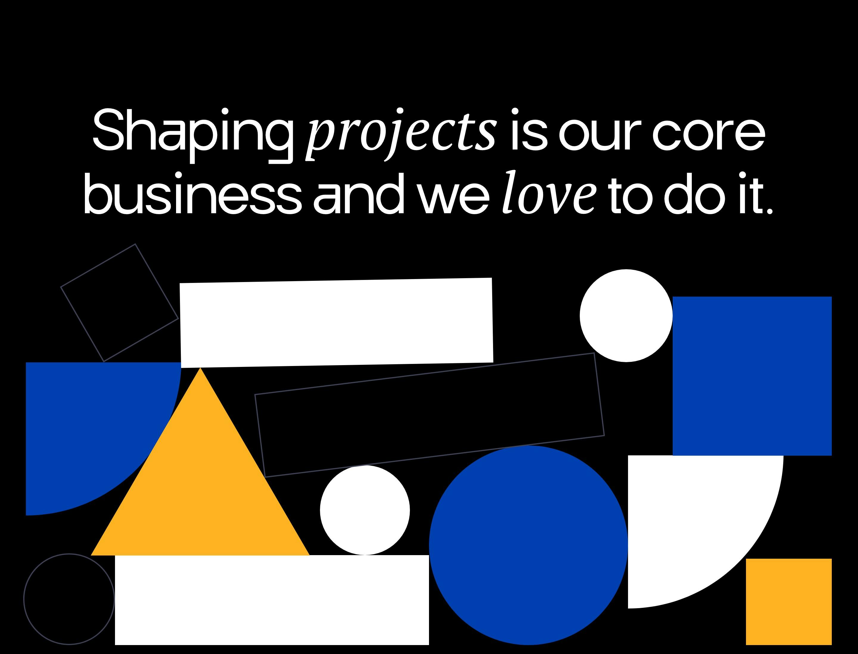
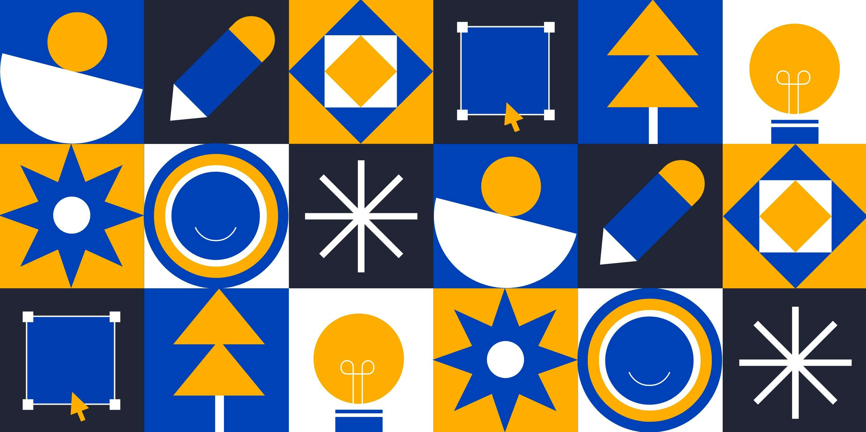
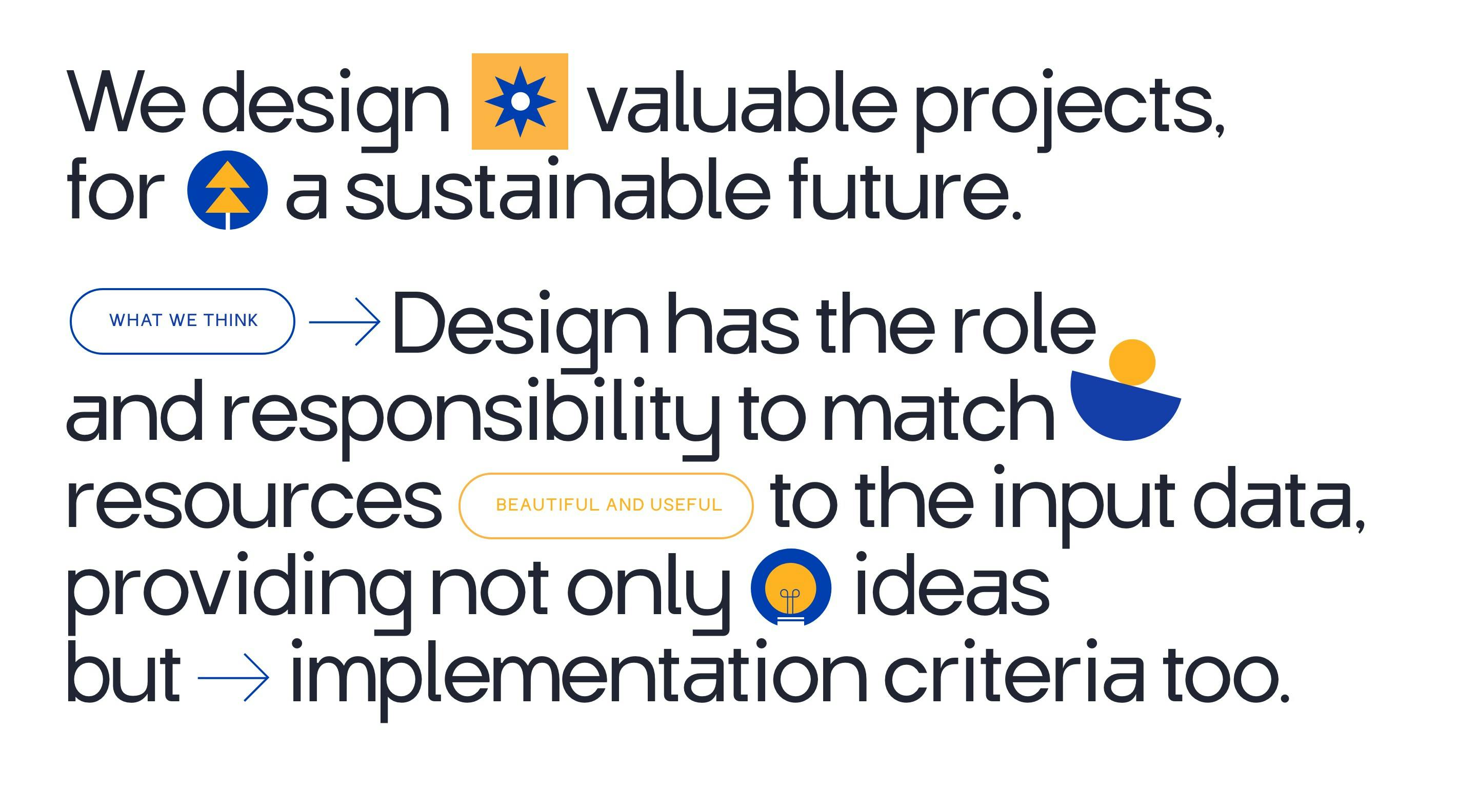
We built a visual identity that rotates around three main shapes that are the foundations of technical design (square, circle, and triangle). The graphic compositions remained clean and minimal to benefit project photos, but the shapes and colors add value and spark interest while making the brand instantly recognizable.